THE SÉBASTIEN NAOMI CLUB
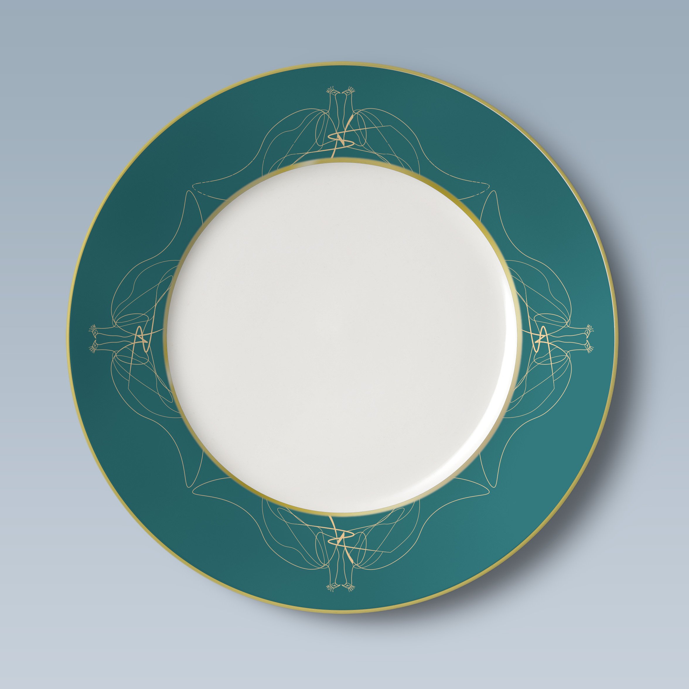
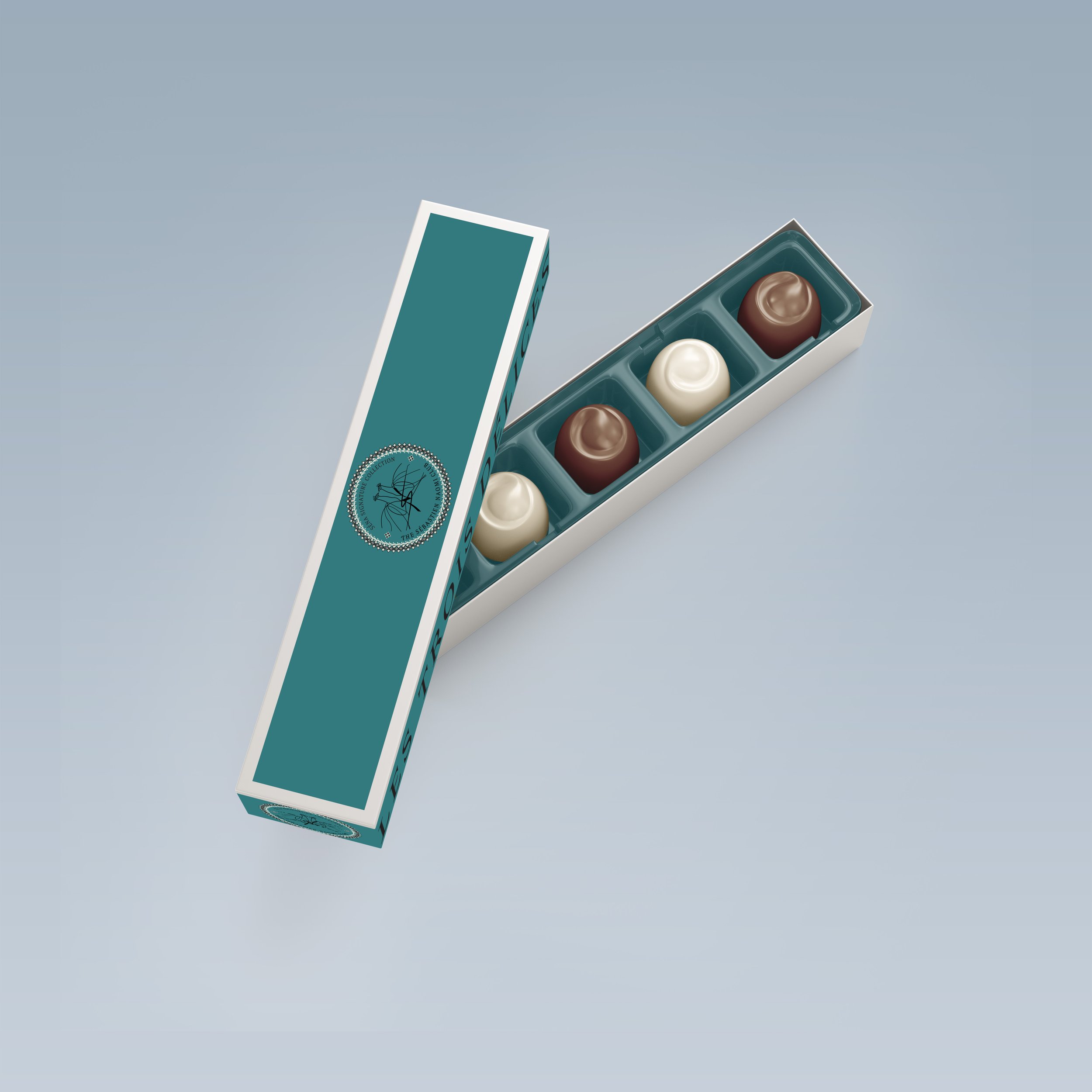
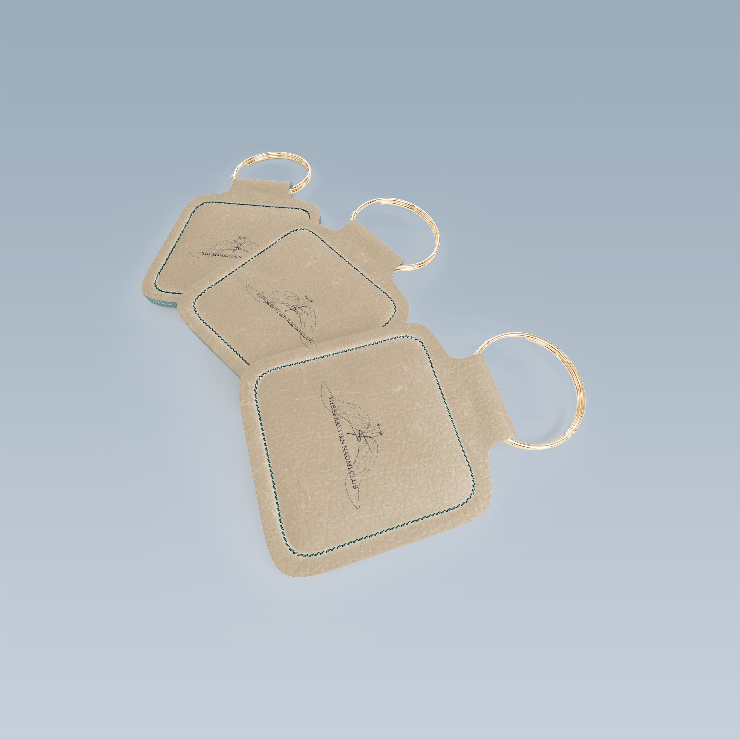
This project includes concept development and refinement, naming, logo design, colors, type, printed and digital publications, branded products, packaging design, menu designs, website, and content curation.
THE CONCEPT
This members-only social club would be a modern twist on the high-society traditional European clubs: White’s on St. James’ meets Home House meets the Birley Clubs. Private members clubs have long been acquainted with the elite upper class and socialites of England/London in particular. While each of the clubs has something unique to them, I struggled to find one club that truly had it all. Many have reciprocity (members are welcome at a range of clubs within their club’s established network). With Sébastien Naomi Club’s SÉNA, members will find everything they need under one roof. More importantly, the same level of quality, attention, and care will be paid to each of the club’s components. While fitness clubs, for example, might offer a selective bar menu, or an arts and culture club might offer a boutique gym, SÉNA prioritizes each element to create a seamless, harmonious, and unparalleled experience.
The name “SÉNA” is a combination of Sébastien and Naomi. The traditional social clubs were for gentlemen only, then ladies-only clubs started arising in response, and today, most clubs are open to both. Keeping in line with “everything under one roof,” and blending tradition with today, SÉNA does a bit of everything. The SÉNA house is divided into different sections enabling members to indulge in tradition as well as come together barring any restrictions. “Naomi” spaces are designated strictly for the ladies, “Sébastien” spaces for the gentlemen, and “SÉNA” spaces for all. All gender-restricted amenities have equal counterparts for the opposite sex as well as gender-neutral spaces of equal splendour.
My overarching concept is strength in both separation and unity; the harmony and balance of contrasting elements that work both together and apart. Every component of this club will align with this concept to create a meaningful and authentic identity that cannot be found elsewhere. Each element from cultural influence, to color, to type, etc., must be strong enough to stand alone as well as instrumental in the overall harmony of the club.
THE LOGO
For the final component of the logo, I decided to add two peacocks as the club’s animal/icon. Using Illustrator, I composed two peacocks united by the S/N symbol presenting the club’s “unity” concept once more. The Phoenix Art Museum describes the symbolism of peacocks: “While representing different meanings to different cultures, the peacock, with its unique beauty, makes it a handy symbol for power, strength, confidence, and even divinity, something with which most monarchs throughout history have wanted to be associated,” www.phxart.org.
I also found that when positioned this way, their profiles create the illusion of angel wings which emphasizes the “divinity” association with these birds. Lastly, for their crown-like head feathers, I incorporated the roman numerals MDCC on one and LXXIV on the other. Together, they spell out “1774” which is the year that the building I chose for SÉNA was last modified to its current facade and the year I chose to be the “founding” of the club. While many social clubs include their founding year as another separate element of their full logo/crest, I thought this was a more subtle approach that didn’t draw too much from the other features.
Peacocks are also considered very social and protective of their homes. For an elite English social club that emphasizes the concept of “home above all” and “everything under one roof,” I could not find a more fitting animal or symbol to add to the brand identity.
CULTURAL INFLUENCE
During the late 19th century, Europe experienced a spike in the popularity of gentlemen’s clubs. At the same time, Japanese seaports opened to international trade, introducing their unique artistic styles to Europe. Particularly in France, these never-before-seen styles became iconic and the term “Japonisme” was coined. Characteristics of Japonisme include asymmetrical compositions, strong lines, dynamism, elongated shapes, cropping at unusual angles, flattened perspective, and decorative use of color.
After selecting the names Sébastien and Naomi, I began researching their meanings and origins and how to best incorporate them into the overall identity of my club. The name “Sébastien” has French-European roots and “Naomi” has Japanese roots as well as French roots from “Noémi.”
The club will incorporate elements of both cultures specifically through cuisine and art honoring them individually through the two main restaurants and blending through visual design elements.
THE LOOKBOOK
BRANDED PRODUCTS & PACKAGING


MENUS
Afternoon Tea Menu
Sips and Smokes Menu
THE WEBSITE
…


